
Web design for dental practices has exactly one commercial job: lowering what a new patient costs you to acquire. Six things move that number, and most practice websites get four of them wrong. None of the six are about how the site looks. What a build actually includes is covered on our small business website design page.
Start with the arithmetic. It reframes the whole purchase.
The only number that matters
US benchmarks put the cost of winning a new dental patient at roughly $150 to $400. In large metros it runs toward the top of that range. Set against it, the lifetime value of a general dentistry patient sits around $5,000 to $8,000.
Read those two figures together. One retained patient covers the cost of a well-built site several times over. That is not a sales line. It is why haggling over the build fee is usually the wrong conversation.
Published US benchmarks for 2026. UK figures run lower in absolute terms but the ranking of channels holds.
Referrals cost zero to fifty dollars per new patient, organic and local search one hundred to two hundred, paid search one hundred to three hundred, and the blended average one hundred and fifty to four hundred.
Notice which channel is cheapest. Search costs about half what paid costs per patient, and it keeps working after you stop paying. That is the whole case for web design for dental practices being worth doing properly.
1. The emergency query you are not answering
Somebody in pain at 9pm searches for an emergency dentist near them. That person books tomorrow, pays without negotiating, and frequently becomes a long-term patient.
Most practice sites handle this badly or not at all. No emergency page. The phone number three scrolls down. Nothing saying whether you can see somebody today. Meanwhile the practice two miles away has a page saying exactly that, so they get the call.
Build one page. State whether you offer same-day appointments, what hours you can be reached, what an emergency appointment involves, and what happens outside those hours. Put the number at the top in a size somebody can tap while wincing.
This is the highest-return page in dentistry and it takes an afternoon. We have never seen a practice regret building it.
2. Booking that works when your phones do not
Patients research dentists in the evening, long after reception closed at five.
A contact form is not booking. It asks somebody to describe their problem in a box and wait an unknown length of time for a reply, which is precisely the friction that sends them back to the search results. Real online booking shows availability and confirms immediately.
| What you offer | What the patient does | Outcome |
|---|---|---|
| Phone number only | Waits until morning, or calls somebody else | Loses evening enquiries entirely |
| Contact form | Writes a message, waits, often forgets | Converts a fraction of the traffic |
| Callback request with a time slot | Picks a window, gets called | Works well for nervous patients |
| Live availability booking | Books and gets confirmation | Highest conversion by a wide margin |
One honest caveat. Live booking only helps if the diary behind it is accurate. A practice that overrides bookings manually creates worse experiences than one that never offered the feature, so fix the workflow before buying the software.
3. Fees, or at least a range
Nearly every dental site hides pricing, and nearly every patient searches for it anyway.
The reasoning behind hiding it is understandable — treatment varies, and you want a conversation before quoting. The effect is that price-sensitive enquiries arrive, consume reception time, and leave when they hear the figure. Publishing a range filters those before they cost you anything.
You do not need a full price list. A range for common treatments, a clear statement about payment plans and finance, and an explanation of what an initial consultation costs is enough. Say what changes the number, then invite the conversation.
Practices that do this consistently report better-qualified enquiries rather than fewer of them. It also happens to be exactly the kind of specific, extractable content that AI-generated search answers cite, which our guide to AI Overviews covers in more detail.
4. Photographs of your actual practice
Patients buy dentistry on trust, and on how calm you make them feel. Stock photos work against both.
A nervous patient wants to know what the room looks like, who will be treating them, and whether the place feels calm. A stock model with unnaturally white teeth in a studio nobody works in answers none of that, and most visitors recognise it instantly even if they never consciously register why the site felt generic.
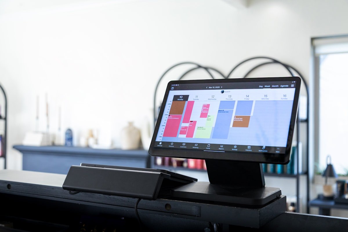
Photography is the cheapest win in web design for dental practices. Photograph the reception, a treatment room, the team as they actually look, and the parking or entrance. A half-day with a local photographer costs less than most practices spend on a single month of advertising, and the assets work for years.
Before-and-after images are powerful where you are permitted to use them, but check your regulator’s position first. The rules differ between the UK and individual US states, and they change.
5. The new patient page almost nobody builds
Here is the gap we see most often in web design for dental practices, and it is strange because the content already exists inside the practice.
Somebody choosing a new dentist has a specific set of questions. What happens at a first appointment. How long it takes. Whether they need to bring anything. What it costs. Whether you take their insurance or plan. Whether you are accepting new patients at all — a surprising number of sites never say.
Answer all of it on one page, which is the single highest-return move in web design for dental practices. Reception answers these questions on the phone twenty times a week, so the material is free. Putting it on the site converts visitors who would not have called to ask, and reduces the calls that produce no booking.
Add one line stating plainly whether you are taking new patients. If you are not, say when you expect to be. Practices lose future patients by staying silent on this far more often than by admitting a waiting list.
6. The map pack decides more than your website does
Uncomfortable, but true for any practice with a front door.
Somebody searching for a dentist nearby sees three map results before any website, which is the limit of what web design for dental practices can fix on its own. If you are not among them, your design work is invisible to that person entirely. Consequently the profile often deserves attention before another penny goes into the site, and our guide to Google My Business optimisation sets out the five signals that decide those slots.
Dentistry has one advantage here that most trades do not. Patients are willing to leave detailed reviews, and detailed reviews are what the algorithm actually reads. Ask at the right moment — after a completed treatment plan rather than after a check-up — and mention the treatment and the town in your request.
Which pages a dental site actually needs
Fewer than you have been sold. Good web design for dental practices starts by cutting the list. Here is the structure we build for practices, and the job each page does.
| Page | Its job | Skippable? |
|---|---|---|
| Home | Say where you are, what you do, and how to book | No |
| New patients | Answer the first-appointment questions | No — highest converting page |
| Emergency | Catch the 9pm search | No |
| Fees and finance | Filter and qualify | No |
| Your main revenue treatments | Rank for what pays | Four to six pages, not twenty |
| The team | Reduce anxiety, show registration | No |
| Contact and directions | Parking, transport, access | No |
| Blog | Only if somebody will write it | Yes, if nobody will |
Eight pages, done properly, beats thirty done thinly. Good web design for dental practices is mostly a set of decisions about what not to build, and this table is the argument we have most often at the briefing stage.
The contact page deserves one specific note. Parking and access matter enormously to anxious and elderly patients, and almost no practice website mentions either. Write two sentences about where to park and whether there are stairs. It reads as trivial and it is not.
How to tell whether your current site is the problem
Before commissioning any web design for dental practices work, decide whether you have a traffic problem or a conversion problem. The fixes share almost nothing, and practices routinely buy the wrong one.
Check your analytics for monthly visitors. Then count new patient enquiries from the site. If you get few visitors, no redesign will help — the constraint is visibility, and that means the map pack and search rankings. If you get plenty of visitors and few enquiries, the site is genuinely the problem and the six items above are where to start.
Most practices we audit turn out to have a visibility problem while believing they have a design problem. That is an expensive mistake to make, because a rebuild does not fix it and costs several times what the actual fix does.
Run the test on your own phone too. Search for a dentist in your town, in a private window, and see where you appear. That thirty-second exercise tells you more than any proposal you will be sent.
What dental websites waste money on
Four things absorb budget in web design for dental practices and return almost nothing. We would rather say so than sell them.
| Spend | Why it fails | Do this instead |
|---|---|---|
| Full-screen video header | Slows the page badly on mobile, where most patients arrive | One strong photograph and a booking button |
| Twenty treatment pages of 200 words | Thin pages compete with each other and rank for nothing | Six substantial pages covering what you actually sell |
| A chatbot answering scripted questions | Patients want an appointment, not a conversation | Live booking, or a callback with a named time |
| Stock imagery of teeth | Recognisable instantly, erodes trust | Your rooms, your team, your entrance |
The twenty-thin-pages problem is the most expensive of the four. Practices are sold a page per treatment because it sounds thorough, then find none of them rank because each says too little to be worth ranking. Our small business SEO checklist covers the depth question in more detail.
What good web design for dental practices costs to run
The build is one payment. The running side is the part practices forget to plan for, and it is small.
Hosting and a domain. Backups and security updates, because a practice site holds enquiry data and downtime costs bookings. A booking system subscription if you use one. And somebody spending an hour a fortnight adding content, which is the item everyone drops first and regrets last.
That last one deserves defending. A site that gains nothing after launch stops climbing within a quarter, and practices then conclude the build failed. It did not. Nobody fed it. One page a month about a treatment, a team change, or a common patient question is enough to keep it moving.
Specific figures vary by country, so we have kept them off this page deliberately. Our breakdowns of website design cost in the UK and small business website cost cover each market properly.
Two mistakes practices make when hiring
Both are understandable and both are expensive.
Hiring the agency with the prettiest dental portfolio. Portfolio screenshots show design, not performance. Ask instead for a practice site they built two years ago, and check on your own phone whether it still loads quickly and whether booking works. Durable beats impressive.
Buying a dental-specific template platform. These are sold as sector expertise and are usually a locked system where you own nothing and every practice using it looks identical. If you leave, you leave with your text and nothing else. Ask who owns the files and the domain before signing, and get the answer in writing.
Sector experience is genuinely worth paying for in web design for dental practices, because regulation and patient psychology both matter here. Just make sure what you are buying is that experience rather than a rented template with a dental theme applied.
The regulatory layer, briefly
Dentistry is advertised under rules other businesses never face, and they differ by country.
In the UK, the General Dental Council sets expectations around how practices present qualifications, treatments and outcomes. In the US, requirements sit with individual state dental boards, so a claim acceptable in one state may not be in another. Both regimes take a dim view of implied guarantees and of testimonials that read as clinical claims.
Practically, that means three habits. Name the clinician and their registration where you make a clinical statement. Avoid superlatives about outcomes. And have somebody clinically responsible read the site before it launches, which takes an hour and prevents the version of this conversation that involves a complaint.
Any agency doing web design for dental practices should raise this unprompted. If they have not mentioned it by the second call, they have not worked in the sector. The same test applies in other regulated professions — our guide to web design for accountants covers the parallel there.
How much should a dental practice spend on its website?
Judge it against your cost per new patient rather than as a standalone figure. If a patient is worth several thousand over their lifetime and costs a few hundred to acquire, a site that reduces that acquisition cost pays for itself inside a handful of patients.
Do I need a page for every treatment?
No, and it usually hurts. Twenty thin pages compete with each other and rank for nothing. Build substantial pages for the treatments that actually drive your revenue, and cover the rest within them.
Is online booking worth it for a small practice?
Yes, provided the diary behind it is genuinely accurate. Patients research in the evening when reception is closed, and live availability converts far better than a form. A booking system your team overrides manually is worse than none.
Should we publish our fees?
Publish ranges rather than a full price list. It filters price-sensitive enquiries before they occupy reception time, and practices that do it report better-qualified enquiries rather than fewer.
Can we use before-and-after photos?
Often yes, but check your regulator first. UK practices work under General Dental Council expectations; US practices under state board rules that vary. Consent and accurate representation matter in both.
Does the website matter more than the Google profile?
For a practice with premises, the profile usually matters more for being found and the website matters more for converting. They are not alternatives — the profile brings people to the site, and the site turns them into appointments.
If you change one thing this month
Build the new patient page. Not a redesign of your web design for dental practices setup, not a new logo — one page answering the questions reception already fields every day.
It takes two hours, costs nothing, and it is the page a person choosing between you and two other practices actually reads. Everything else in web design for dental practices is optimisation on top of that.
Then measure. If enquiries move, you have learned something about where the constraint sits. If they do not, the problem is upstream and you should look at the map pack before commissioning anything larger.
Acquisition and lifetime value figures are published US industry benchmarks for 2026 and are cited below; UK figures differ in absolute terms. This is general commercial guidance, not clinical, legal or regulatory advice. Check current requirements with your own regulator. Last reviewed August 2026.