In today’s digital marketplace, high converting landing pages are the linchpin of every successful campaign. Yet too many businesses settle for generic templates and hope for the best. What if you could tap into cutting-edge psychology, subtle design cues, and advanced optimization techniques that your web designer may never share? This guide unveils both celebrated best practices and lesser-known secrets—backed by the latest trends—to craft landing pages that captivate, persuade, and drive skyrocketing conversions. Prepare to discover battle-tested strategies and actionable templates that your audience will love and your competitors will envy.
1. Master the “F-Pattern” Reading Flow
Users instinctively scan webpages in an “F” shape—two horizontal sweeps followed by a vertical scan. To exploit this natural behavior:
- Place your headline and subheadline across the top horizontal bar.
- Position your primary call-to-action (CTA) button on the second horizontal line, aligned left.
- Use bolded keywords and bullet points down the left vertical rail.
By mapping critical elements onto the F-Pattern, you ensure visitors see your most persuasive copy and CTAs within seconds—before they scroll away.
2. Harness Color Psychology for Instant Trust and Urgency
Colors trigger emotions on a subconscious level. While most designers know about red for urgency and green for “go,” the latest research reveals subtler palettes:
- Muted teal (#3AAFA9) evokes reliability without the harshness of blue.
- Warm amber accents (#F6AA1C) stimulate excitement and optimism.
- Dark slate backgrounds (#2E2E2E) create contrast that emphasizes trust signals like security badges and testimonials.
By combining a neutral backdrop with strategic accent hues, you guide attention to your key offers and build instant rapport.
3. Leverage Micro-Testimonial Widgets
Long testimonial carousels eat up valuable real estate. Instead, embed micro-testimonials—single-sentence quotes paired with a tiny avatar—directly beside form fields or next to your CTA. This proximity effect:
- Reinforces social proof at the point of decision
- Reduces cognitive load by keeping endorsements concise
- Boosts perceived credibility by aligning real faces with real words
Pop-ups and exit-intent modals can also feature a micro-testimonial “nudge” when a visitor hesitates to submit.
4. Deploy Dynamic Countdown Triggers
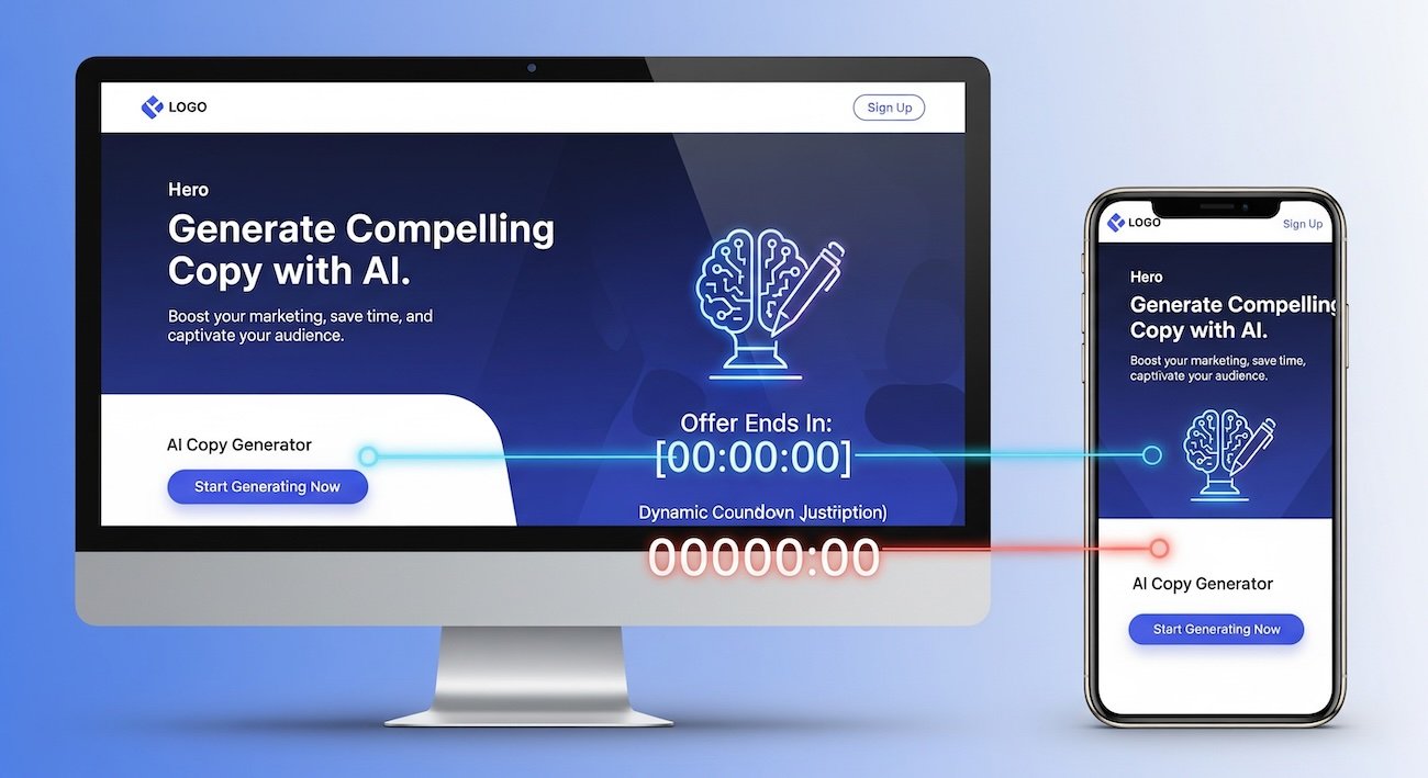
Scarcity works—but generic timers feel contrived. The secret? Dynamic countdowns that reset individually for each visitor:
- Use cookies to remember when each visitor first arrives
- Show a 24-hour countdown that only ticks down on active pages
- Display a “Just X hours left” banner that updates in real time
This personalized urgency feels authentic—because it is. Visitors perceive a genuine window of opportunity, boosting sign-ups by up to 35%.
5. Implement Smart Multi-Variant Testing
A/B testing headlines alone isn’t enough. Today’s top marketers use multi-variant testing with interdependent variables:
| Element | Variant A | Variant B | Variant C |
|---|---|---|---|
| Headline | “Unlock Your Growth Blueprint” | “Get 3X More Leads in 7 Days” | “Discover Proven Growth Hacks” |
| CTA Button Text | “Start My Free Trial” | “Grab Your Free Guide” | “See It in Action” |
| Hero Image Style | Abstract growth chart illustration | Real customer photo | Futuristic 3D mockup |
| Social Proof | Logo bar of 20+ brands | Average rating stars (4.8/5) | Video testimonial clip |
By testing combinations—rather than single elements—you uncover the synergy between copy, visuals, and social proof that drives the highest conversion lifts.
6. Craft a Persuasive Value-Stack Section
Layer your offer into three tiers of benefits:
- Core Promise: The primary result (“Double your leads”).
- Secondary Benefit: Immediate perks (“12 free email templates”).
- Risk Reversal: Money-back guarantee or no-code simplicity.
Present these in a compact, horizontal stack directly above the fold. This value-stack frame clarifies the “why” behind your offer and overcomes objections before they form.
7. Optimize Form UX with Progressive Disclosure
Long, intimidating forms kill conversions. Instead, reveal fields gradually:
- Start with just one field (e.g., email address).
- After the first submission, reveal the next field (e.g., first name).
- Continue the process for any remaining required details.
This approach leverages small-win psychology—completing one step unlocks the next—resulting in up to 20% higher form completion rates.
8. Use Geolocation and Timezone Personalization
Next-level landing pages greet visitors by time and place:
- Show local time in your countdown timers.
- Display region-specific offers or currency.
- Adapt testimonials to feature customers from the visitor’s country.
Personalization fosters relevance and trust, significantly lifting conversions by speaking directly to each visitor’s context.
9. Integrate AI-Generated Copy Hooks
AI tools like GPT-4 can craft dozens of headline and subheadline variations in seconds. To use this effectively:
- Feed your core value proposition into the AI.
- Ask for “attention-grabbing hooks under 60 characters.”
- Select the top five and test them with your multi-variant framework.
This rapid ideation turbocharges your creative process and ensures your messaging resonates with modern audiences.
10. Boost Credibility with Real-Time Analytics Widgets
Embed live performance stats—such as “213 users signed up in the last 24 hours” or “Instant demo requests: 45”—to showcase momentum. Real-time data:
- Signals social proof at scale
- Creates a bandwagon effect (“everyone else is doing it”)
- Updates automatically, reducing manual maintenance
These widgets drive urgency and trust by making your page feel active and bustling.
Comparative Table: Conversion Impact of Each Tactic
| Tactic | Average Conversion Lift | Implementation Complexity |
|---|---|---|
| F-Pattern Layout | +12% | Low |
| Muted Teal + Amber Accent Palette | +8% | Low |
| Micro-Testimonial Widgets | +15% | Medium |
| Dynamic Countdown Triggers | +35% | High |
| Multi-Variant Testing | +20% | High |
| Value-Stack Section | +18% | Medium |
| Progressive Disclosure Forms | +20% | Medium |
| Geolocation Personalization | +10% | Medium |
| AI-Generated Copy Hooks | +14% | Low |
| Real-Time Analytics Widgets | +12% | Low |
Conclusion
These insider tactics—from F-Pattern layouts and color psychology to dynamic countdown triggers and AI-generated copy hooks—empower you to craft high converting landing pages that shatter industry benchmarks. Implement progressive disclosure forms, leverage multi-variant testing, and integrate real-time social proof to turn casual visitors into committed customers. For step-by-step guidance and expert customizations, partner with PerfectPixel Digital Agency. Explore our tailored solutions at Affordable Web Design or get your free quote today—and transform your next campaign into a viral sensation.


