Running a small business in New York City means fighting brutal overhead, ruthless competition, and customers with zero patience. Stop buying “pretty” websites that act like digital brochures. In this deep dive, we tear down three real-world NYC business scenarios to show you exactly why they were losing money, and the precise design mechanics required to rank on Google and convert local traffic.
Let’s be brutally honest about the state of small business web design in New York City right now.
If you walk down any avenue in Manhattan or Brooklyn and look at the storefronts, you see incredible businesses. You see passion, grit, and amazing products. But when you pull out your phone and search for those exact same businesses online, their digital storefronts are a disaster. They are slow, confusing, and look like they were built ten years ago.
Why does this happen? Because for years, small business owners have been sold a lie by marketing agencies. They were told that to succeed online, they needed to buy “brand awareness” and “beautiful aesthetics.” Agencies charged them £5,000 to £15,000 for massive, heavy websites full of auto-playing videos, slow-loading animations, and stock photos of the Empire State Building.
But the average New Yorker does not care about your website’s aesthetic vision. When someone in NYC pulls out their phone to search for a business, they are usually in a rush, in transit, or dealing with a specific problem. They are experiencing what Google calls a “micro-moment.” They want an answer, a price, or a phone number, and they want it in under two seconds.
If your website makes them wait, makes them hunt for a contact button, or forces them to pinch-and-zoom to read your menu, they are gone. They will hit the back button and go to your competitor. This is why understanding why small businesses need a digital asset engineered for speed is critical. It is not about art; it is about behavioural psychology and friction removal.
To truly understand how to win digital market share in the five boroughs, we need to stop talking about theory. We need to look at the actual mechanics of a website. Below, we are going to tear down three highly specific, real-world NYC small business scenarios. We will look at why their old websites were actively destroying their revenue, and exactly what structural changes forced them to rank on Google and print money.
Teardown 1: The Queens Emergency Plumber
The Scenario: It is late January. A homeowner in Astoria wakes up at 6:00 AM to find their basement flooding from a burst pipe. They are stressed, cold, and holding their phone with one hand while trying to move boxes with the other. They search “emergency plumber near me.”
The Old Website (Why it Failed)
- The Hero Image Trap: The top of the website featured a massive, high-resolution stock photo of the Manhattan skyline at night. Because it was an uncompressed 3MB file, it took 4.5 seconds to load on a mobile 4G connection. In an emergency, 4.5 seconds feels like a lifetime. The user bounced.
- The Hidden Phone Number: The phone number was tiny, colored light grey, and buried in the top right corner of the header menu. On a mobile screen, the user had to use two hands to pinch, zoom, and try to tap it.
- The “Contact Us” Form: Instead of pushing the user to call, the main button said “Contact Us” and led to a page with a 10-field form asking for their name, email, home address, budget, and a message. Nobody with a flooding basement is filling out a questionnaire.
The New Architecture (Why it Converts)
- Brutalist Speed & Value Proposition: We deleted the skyline photo. The site now loads in 0.4 seconds. The top of the screen is pure, high-contrast text that says: “24/7 Astoria Emergency Plumbing. We Arrive in Under 45 Minutes.” It answers the user’s only two questions instantly: Can you fix this now, and do you serve my neighborhood?
- The “Thumb Zone” Click-to-Call: We removed the phone number from the top header. Instead, a massive, bright green button is anchored to the bottom edge of the mobile screen. It says “Tap to Call an Engineer Now.” It stays there even if the user scrolls. It is perfectly positioned for a frantic, one-handed thumb tap.
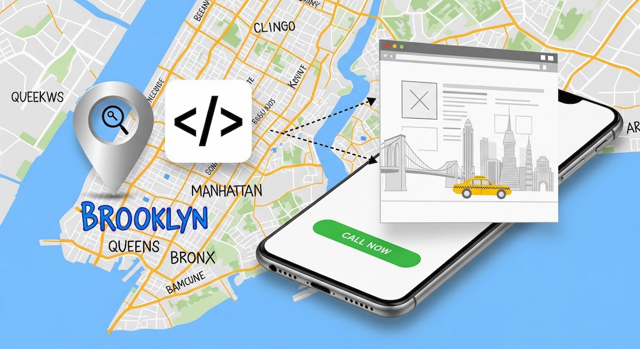
- Geo-Fenced Schema Markup: The old site tried to rank for “Plumber NYC”—which is impossible for a small shop. We injected JSON-LD LocalBusiness schema code into the background. This code mathematically tells Google that this business only serves Queens and specific Long Island border zip codes. Google’s algorithm loves specificity, causing the site to shoot to the top of the Maps pack for local Astoria searches.
Teardown 2: The SoHo Specialty Coffee Shop
The Scenario: It is 1:15 PM on a Tuesday. An office worker in SoHo is walking back from a meeting and wants an iced oat flat white. They are walking fast, texting a coworker, and searching Google Maps for “coffee near me.” They click on a local independent shop instead of Starbucks.
The Old Website (Why it Failed)
- The PDF Menu Nightmare: When the user clicked “Menu,” the website tried to force them to download a 5MB PDF file of the printed in-store menu. The text was tiny. The user had to download a file to their phone, pinch to zoom, and scan through breakfast items to find the coffee prices. They gave up and walked to a corporate chain.
- “Vibes” Over Data: The homepage featured a beautiful, auto-playing video of espresso dripping into a cup. It looked great on a 27-inch iMac in the design agency’s office. On a mobile phone walking down Spring Street, it drained battery, stuttered, and pushed the actual address of the shop below the fold.
- No Ordering Integration: To order ahead, the user had to download a separate, clunky third-party app, create an account, and verify their email. Massive friction.
The New Architecture (Why it Ranks & Converts)
- Native HTML Menus: We destroyed the PDF. The menu is now built using native HTML text. Why? Because Google cannot easily read text trapped inside a PDF. By using HTML, Google’s crawlers can index every single item. Now, when someone nearby searches “Oat milk flat white SoHo,” this specific shop shows up in the search results because the algorithm knows they sell it.
- Frictionless Commerce: We integrated a seamless web-ordering system directly into the site using Apple Pay and Google Pay. No account creation required. The user taps “Order Ahead,” authenticates with their face ID, and the order is sent to the barista’s tablet. Checkout takes 4 seconds.
- Authenticity Signals: We removed the slow, generic espresso video. We replaced it with a single, highly compressed, raw photo of the actual storefront from the street level. This triggers “Vision AI” trust signals for Google, and helps foot-traffic customers immediately recognize the shop when walking down the block.
Teardown 3: The Midtown Corporate Law Firm
The Scenario: A mid-sized tech startup in Chelsea just received a threatening cease-and-desist letter regarding intellectual property. The CEO is panicking. They need a serious, highly competent commercial litigator. They search for “IP litigation lawyer Manhattan.” This is a high-ticket, high-trust purchase.
The Old Website (Why it Failed)
- The Commodity Copywriting: The website looked like every other law firm on earth. The headline said, “Dedicated to Client Success.” The copy was full of legal jargon and vague promises about “fighting for you.” It offered zero specific proof of competence. It read like it was generated by AI.
- Ghost Town Blog: The firm had a blog, but the last post was from 2021 and was a generic 400-word article about “What is a trademark?” It showed a complete lack of active expertise.
- Zero Trust Signals: The “About Us” page featured a generic photo of a gavel and some law books. The lawyer biographies were hidden three clicks deep and lacked direct contact information. The CEO left the site because they felt no personal connection or trust.
The New Architecture (Why it Prints Money)
- E-E-A-T Injection (Experience, Expertise, Authoritativeness, Trust): We rewrote the site to focus entirely on proprietary knowledge. The new headline reads: “We Protect Chelsea Tech Startups from Predatory IP Litigation.” It speaks directly to the target audience. We added raw video of the senior partners explaining recent (anonymized) case victories in plain English.
- Information Gain via Content: We deleted the useless generic blog posts. Instead, we published deep, 2,000-word “Pillar Pages” breaking down the exact mechanics of defending a software patent in New York courts. This is called “Information Gain.” Google heavily rewards content that shares actual, real-world experience that an AI tool cannot hallucinate.
- Author Entity Schema: This is a massive SEO secret weapon. We linked every single article and biography page directly to the attorneys’ verified New York State Bar Association profiles using backend JSON-LD code. We mathematically proved to Google that these are real, licensed experts, drastically increasing the domain’s authority score for legal queries.
The Financial Reality of “Cheap” Web Design
After reading those teardowns, you might be thinking: “This all makes sense, but I’m a small business. I can’t afford a massive agency to build this for me. I’ll just use Wix or pay a guy on Fiverr £300.”
This brings us to the most dangerous trap in the NYC digital market. You must understand the brutal risks of cheap web design. There is a massive difference between upfront cost and the Total Cost of Ownership (TCO).
When you use a drag-and-drop builder like Squarespace or hire someone to install a cheap $50 template, you are buying Technical Debt. To allow you to drag elements around a screen without coding, those platforms generate thousands of lines of hidden, bloated code in the background (known as DOM bloat).
When a customer on a weak cellular signal in the subway tries to load your cheap template, their phone processor chokes on all that hidden code. The site takes 6 seconds to render. The customer leaves. Google’s algorithm tracks this. They see that users are bouncing off your site, so they actively suppress your business in the local search rankings.
You didn’t save money by spending £300. You bought an invisible anchor that actively prevents you from making money. True affordability means investing in a lean, natively coded asset that you own completely. You pay a professional once to engineer it correctly, and it generates leads for years without requiring a £40-a-month subscription to a closed platform.
How to Audit Your NYC Website Tonight
You don’t need to be a developer to figure out if your website is hurting your business. Do this 3-step test tonight:
- The 4G Commuter Test: Turn off your Wi-Fi. Stand outside on the street. Open an incognito browser on your phone and load your website. Count the seconds in your head. If it takes longer than “One-Mississippi, Two-Mississippi” for the text to become readable, you are bleeding foot traffic.
- The One-Handed Thumb Test: Hold your phone in one hand. Without using your other hand, try to find your phone number and tap it. Try to find your pricing. If you have to contort your hand, zoom in, or click a tiny menu icon, your User Experience is broken.
- The Generic Copy Test: Read the first headline on your homepage. If your competitor could copy and paste that exact same headline onto their website and it would still make sense (e.g., “Quality Services You Can Trust”), your copy is a commodity. You have zero unique value proposition.
If you failed any of those three tests, your digital storefront requires structural renovation. The NYC market is too dense and too competitive to rely on a broken digital foundation. It is time to stop thinking of your website as a digital business card, and start engineering it like a high-performance commercial machine. And the first step of that process is optimising your Google Business Profile to work seamlessly with your new, high-speed site.
The Final Verdict: Treat Digital Rent Like Physical Rent
If you leased a commercial storefront in Tribeca, you wouldn’t leave the windows boarded up, the lights flickering, and the front door locked during business hours. Yet, that is exactly what thousands of NYC businesses do with their digital real estate every single day.
Your website is the hardest working employee you have. It never sleeps, it never takes a sick day, and it handles every single prospective customer’s first impression. Stop starving it of proper engineering. Stop buying cheap, bloated templates that actively repel New Yorkers who are in a rush to give you their money. Build a lean, brutalist, high-speed machine that respects your customer’s time and algorithmically forces Google to take you seriously.
The Unvarnished NYC Web Design FAQ
We pull these questions directly from the trenches—what NYC business owners are actually asking on Reddit, in consulting calls, and when their current websites fail to deliver ROI.
Do I need a physical address in Manhattan to rank in NYC local search?
No, but you absolutely cannot fake one. Historically, businesses based in New Jersey or Long Island would buy a “Virtual Office” (like a WeWork or Regus mailbox) in Manhattan to trick Google Maps. In 2026, Google actively suspends profiles that use virtual offices. If you do not have a physical storefront, you must build your website and Google Business Profile as a Service Area Business (SAB). You hide your residential address and use precise Schema markup on your website to draw a digital polygon over the exact NYC zip codes you service.
Why does my website load instantly in my office, but customers say it’s slow?
Because you are viewing it on a cached desktop browser connected to high-speed fiber internet. Your customers are loading it on iPhones while riding the N train over the Manhattan Bridge, battling extreme packet loss and congested 5G cell towers. If your website relies on heavy JavaScript and uncompressed images (DOM bloat), a commuter’s phone CPU will literally choke trying to render it. You must engineer specifically for degraded mobile connections.
Is a “.nyc” domain name better for local SEO than a “.com”?
From a pure algorithmic standpoint, Google treats a `.nyc` extension exactly the same as a `.com` or `.net`. It does not give you an automatic “SEO boost.” However, from a human conversion standpoint, a `.nyc` domain instantly signals local authenticity to a resident. It builds immediate geographical trust. If you can get a clean, memorable `.nyc` domain, buy it, but know that you still have to do the hard technical SEO work to make it rank.
How do I compete with giants like Yelp, Seamless, or Zillow in search results?
You don’t fight them head-on; you flank them using “Long-Tail Specificity.” If you are a restaurant, you will never outrank Yelp for the broad term “Best Italian Food NYC.” Instead, you engineer your website to capture hyper-specific intent. You build a landing page for “Gluten-Free Private Dining Room in the West Village.” Yelp’s massive, generic directory structure cannot compete with a deeply optimized, highly specific local landing page. You win on niche relevance, not broad volume.
My agency wants to build a “Headless” website. Is that necessary for a small business?
Almost never. “Headless” architecture separates the backend (where you write content) from the frontend (the code the user sees). It is incredibly fast, but it is also massively expensive to build and requires a full-time developer to maintain. For 99% of NYC small businesses, a properly engineered, natively coded WordPress block theme (Gutenberg) can achieve near-identical sub-second load speeds for a fraction of the setup and maintenance costs. Headless is an enterprise solution often mis-sold to small businesses.
Surviving New York’s digital rent starts with a site that can hold its own. See our affordable web design for small businesses — built for competitive markets.
Surviving New York’s digital rent means the site has to bring in customers. Our small business SEO services are built for exactly this kind of competitive local-search environment.