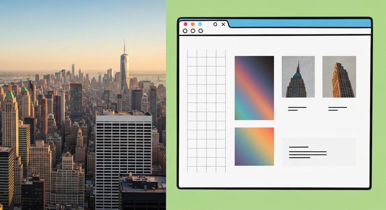
To build physical real estate in New York City, you must conquer bedrock, zoning laws, and gravity. To build digital real estate in New York City in 2026, you must conquer algorithmic rendering paths, semantic entity mapping, and the severely depleted attention spans of eight million residents. The fundamental problem with the modern internet is that 90% of small businesses are buying digital strip-malls and expecting them to perform like the Empire State Building.
For too long, web design has been treated as a superficial exercise in graphic design. Agencies slap a fresh coat of CSS paint over a fundamentally broken, bloated, drag-and-drop template and sell it as a premium asset. But Google’s 2026 machine learning algorithms—obsessed with Core Web Vitals, Interaction to Next Paint (INP), and deep Knowledge Graph integration—do not care about the paint. They evaluate the foundation. They scan the structural integrity of the code.
The most sophisticated agencies executing small business web design in NYC have completely shifted their paradigm. They no longer operate as graphic artists; they operate as Digital Architects. They borrow heavily from the physical design movements that shaped the five boroughs. This masterclass deconstructs exactly how physical architectural principles are being translated into elite, high-ROI web engineering, and why bridging these two disciplines is the ultimate competitive advantage.
Chapter 1: The Commissioner’s Plan and CSS Grid Architecture
In 1811, the New York State Legislature adopted the Commissioner’s Plan, establishing the iconic, rigid grid system that defines Manhattan from 14th Street up to Washington Heights. This was a masterstroke of urban UX (User Experience). A stranger can emerge from a subway station at 34th and Broadway and immediately understand their spatial relationship to the rest of the island. Predictability breeds efficiency.
Translating the Street Grid to the DOM
In web design, predictability is equally paramount. The human eye scans a digital screen in distinct patterns (the F-pattern for text, the Z-pattern for landing pages). When a website uses chaotic, unstructured layouts—where elements load asynchronously and shift the viewport around—it induces severe cognitive load. It is the digital equivalent of navigating the winding, illogical streets of the West Village without a map.
Elite digital architects utilize advanced CSS Grid and Native Flexbox architectures. By establishing a rigid, underlying mathematical grid (often based on an 8-point or 12-column system), every digital element—from typography to high-fidelity AVIF imagery—is anchored to a predictable baseline. This alignment creates a subconscious sense of stability and commercial trust for the user.
Furthermore, a rigid CSS Grid drastically improves algorithmic performance. Browsers like Chrome can calculate and paint a native CSS grid exponentially faster than a bloated layout built with deeply nested <div> wrappers generated by cheap page builders. This directly lowers your Largest Contentful Paint (LCP) times, a critical ranking factor for NYC local search.
Chapter 2: Form Follows Function (The Bauhaus Influence)
“Form follows function,” the famous axiom coined by architect Louis Sullivan and championed by the Bauhaus movement, dictates that the shape of a building should be primarily based upon its intended purpose. The Seagram Building on Park Avenue is a masterclass in this philosophy: functional, stripped of unnecessary ornamentation, and visually striking due to its pure expression of structure.
The Eradication of Digital Ornamentation
In the early 2020s, web design suffered an era of extreme digital ornamentation. Websites were plagued with massive, full-screen video backgrounds, complex WebGL 3D animations, and JavaScript scroll-hijacking. While visually arresting, these elements served no commercial function. They acted as severe friction points, destroying conversion rates and draining mobile device batteries.
The 2026 architectural mandate is Ruthless Essentialism. If a digital element does not actively guide the user toward a conversion, clarify a complex topic, or build verifiable E-E-A-T (Experience, Expertise, Authoritativeness, and Trustworthiness), it is permanently excised from the DOM.
- Typography as the Interface: Abandoning heavy image banners in favor of massive, fluid typography. Words become the primary navigational and structural elements, instantly conveying the value proposition without requiring a 3MB image download.
- Semantic HTML5 Hierarchy: Just as a skyscraper has a lobby, an elevator core, and penthouses, an elite website uses strict semantic tags (
<header>,<main>,<article>,<footer>) to signal architectural hierarchy to screen readers and Google’s crawling bots.
Is Your Digital Architecture Structurally Sound?
Stop patching bloated templates. Partner with elite digital architects to engineer a high-performance, semantic conversion engine built specifically for the ruthless New York market.
Chapter 3: Digital Brutalism and Core Web Vitals
Brutalism, characterized by massive, monolithic forms and the exposure of raw building materials (specifically *béton brut* or raw concrete), is highly polarizing in the physical world. However, in the digital realm, Digital Brutalism has emerged as the ultimate weapon for dominating search engine performance metrics.
The Beauty of Raw Code
Digital Brutalism does not mean making a website ugly; it means exposing the raw mechanics of the web. It embraces stark contrast, default system fonts, visible grid lines, and native HTML form elements. By deliberately refusing to load massive external CSS frameworks (like Bootstrap) or heavy JavaScript animation libraries (like GSAP), the code becomes astonishingly lightweight.
When you deploy a brutalist, natively coded architecture, you achieve what commodity agencies consider impossible: perfect 100/100 scores across Google’s Core Web Vitals. The Interaction to Next Paint (INP) drops to sub-50 milliseconds. The site renders instantly, even on a degraded 4G connection deep inside the MTA subway system. In the highly competitive NYC local search market, Google’s algorithms actively reward this extreme speed, catapulting brutalist architectures over their bloated, visually heavy competitors.
The Algorithmic Impact of Digital Architecture
Chapter 4: Art Deco and the Psychology of Micro-Interactions
If Brutalism is the structural concrete, Art Deco is the premium finish. The Chrysler Building is celebrated not just for its height, but for the meticulous, obsessive detailing of its terraced crown and elevator doors. In web design, this level of premium craftsmanship is achieved through CSS Micro-Interactions.
A micro-interaction is a subtle, almost imperceptible piece of feedback that occurs when a user engages with the interface. It is the digital equivalent of the satisfying, heavy *click* of a solid brass door handle.
- Tactile State Changes: When a user hovers over a CTA (Call to Action), the button shouldn’t just change color; it should subtly depress, utilizing a hardware-accelerated CSS
transform: translateY()and a soft box-shadow adjustment. This provides instantaneous tactile feedback. - Skeleton Loading States: Instead of a generic spinning wheel, elite sites use skeleton screens—lightweight, shimmering wireframes that map exactly to the dimensions of the incoming content. This severely reduces perceived wait times and prevents layout shifting.
These micro-details do not cost heavy performance points, but they subconsciously signal massive brand equity. They tell the NYC consumer that if you are this meticulous about your technical search engine optimization and code structure, you will be equally meticulous about delivering your core business service.
Chapter 5: Spatial Wayfinding and the NYC “Thumb Zone”
Grand Central Terminal is an architectural masterpiece of spatial wayfinding. It manages to push 750,000 bodies through a confined space daily with minimal friction, utilizing wide sightlines, subtle lighting cues, and intuitive flow patterns. Your website’s navigation must operate on the exact same psychological principles.
Designing for the Commuter
Over 70% of local searches in New York City occur on a mobile device, often while the user is actively moving—walking down a crowded avenue or holding a subway pole. If your website relies on a tiny, hard-to-tap “hamburger” menu buried in the top right corner of the screen, you are creating massive friction.
Modern architectural web design maps the Mobile Thumb Zone. It physically relocates critical navigational vectors and high-priority conversion points to the bottom edge of the screen. By anchoring a “Click to Call” or “Request Quote” button to the bottom viewport edge, it remains in a permanent, effortless striking distance for one-handed thumb navigation. This spatial adaptation alone can increase mobile conversion rates by upwards of 30%.
Does Your Website Convert NYC Traffic?
A beautiful site is useless if it doesn’t generate revenue. Discover the architectural secrets behind high-ROI lead generation.
Chapter 6: Claiming Digital Real Estate (Semantic Entity Mapping)
Having the most beautifully engineered building in Manhattan is useless if it is invisible. In the physical world, location is everything. In the digital world, your “location” is determined by your semantic integration into Google’s Knowledge Graph.
You cannot simply write “Plumber in Brooklyn” on your homepage and expect to rank. You must execute architectural SEO. This involves writing raw, machine-readable JSON-LD LocalBusiness schema into the `
Final Blueprint: The 2026 Mandate
The era of the digital brochure is permanently over. A website is no longer a marketing expense; it is a structural commercial asset. To dominate the New York market, you must stop treating web design as an exercise in aesthetics and demand that it be treated as an exercise in structural engineering. By utilizing the principles of physical architecture—grid stability, brutalist performance, and precise spatial wayfinding—you build a digital fortress that competitors cannot breach and algorithms cannot ignore.
Architectural Web Design FAQ
Why does a custom “architectural” website cost more than a Wix template?
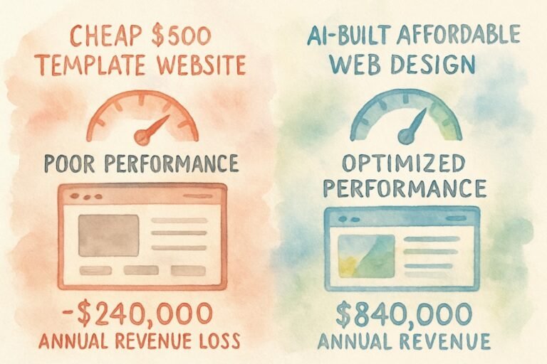
Why does a custom-built high-rise cost more than a prefabricated shed? You are not paying for the visuals; you are paying for the engineering. A template is bloated with thousands of lines of unused code, severely throttling its ability to rank on Google (due to poor INP and LCP scores). A custom architectural build is natively coded, entirely bespoke to your entity, and engineered specifically to capture organic search real estate. It is a revenue-generating asset, not an expense.
What does “Mobile-First Architecture” actually mean?
It means the design process physically begins on the smallest viewport. We do not design a massive desktop site and try to “squish” it down onto a phone. We map the core user journey, structure the thumb-zone navigation, and prioritize the DOM rendering path for a mobile device on a 4G connection first. Only once the mobile foundation is perfectly rigid do we expand the architecture for desktop screens.
How does web design impact NYC Local Search rankings?
Profoundly. Google’s local algorithm measures User Experience signals heavily. If your site structure is chaotic, users will bounce back to the search results (pogo-sticking), signaling to Google that your entity is low-value. Furthermore, proper architectural structure includes deep schema integration, flawless semantic tagging, and Core Web Vitals optimization—all of which are direct, heavily weighted ranking factors in the modern search index.
Architecture-inspired design is our baseline, not an upsell. See our full approach to affordable web design for small businesses across the US, UK, and Switzerland.


