
Web design for plumbers is not really about design. Five things decide whether somebody standing in a flooding kitchen calls you or taps the next result down, and most trade websites get four of them wrong while looking perfectly professional. Our small business website design page covers what a build includes.
Start by accepting who the visitor is. Web design for plumbers serves somebody on a phone, stressed, deciding in seconds.
Your website has about ten seconds
Picture the real scenario rather than the one in a design mockup. Water is coming from somewhere. One hand holds a phone, the other holds a towel. Mobile signal is average. Patience is zero.
That person needs three facts and nothing else. Do you cover my area. Can you come now. What is the number. Everything else on the page is decoration until those three are answered. Restaurants face a similar map-pack problem, covered in restaurant website design.
Yet the typical trade website opens with a full-width photograph, a slogan about quality workmanship, and a phone number in the footer. It is not a bad website. It is answering questions nobody in that moment is asking.
1. The phone number is the design
Put it at the top, make it tappable, and size it for a wet thumb. Nothing in web design for plumbers matters more.
This sounds obvious and it fails constantly. Some sites render the number as an image nobody can tap. Others bury it in the footer. A few open a dialer with no warning because there was no icon. Every one of those loses calls from people who were ready to make one.
| Setup | What happens |
|---|---|
| Tappable number in a sticky header | Calls from anywhere on the site, one thumb |
| Number in the header, not tappable | They memorise it, or they leave |
| Number in the footer only | Most never scroll that far |
| Contact form instead of a number | For emergency work, close to no conversions |
Add a second line under it stating your hours plainly. “Answering until 9pm, seven days” converts better than “24/7 emergency service” because one is believable and the other is what everybody claims.
2. Emergency and planned work are different businesses
This is the strategic point most trade sites miss, and it is the costliest gap in web design for plumbers.
Somebody with a burst pipe and somebody planning a bathroom refit are not the same customer. The first wants speed and will not compare prices. The second wants reassurance, examples of past work, and a sense of what it costs. Serving both from one page serves neither well.
| Emergency buyer | Planned buyer | |
|---|---|---|
| Decides in | Under a minute | Days or weeks |
| Compares | Nothing | Three quotes |
| Wants to see | Number, area, availability | Photos, reviews, pricing shape |
| Arrives from | Map pack, mostly on mobile | Search and referral, often desktop |
| Page they need | A stripped emergency page | A detailed service page |
Build both. Your emergency page carries the number, the coverage area and the hours, with almost nothing else on it. Planned-work pages carry photographs, prices where you can give them, and enough detail to justify a higher quote than the cheapest bidder.
The same split applies to electricians, heating engineers and HVAC contractors. Whatever the trade, the emergency job and the planned job need different pages because they need different arguments.
3. Say exactly where you go
A vague coverage statement costs you calls from people you would happily have driven to. Web design for plumbers lives or dies on this detail.
“We cover the surrounding areas” tells a homeowner nothing. Name the towns, suburbs or postcodes you actually work in, and put it above the fold rather than on a separate page. If there is a radius beyond which you charge a call-out, say so — it filters out journeys you did not want anyway.
Now the part where trades get badly advised. Generating fifty near-identical pages, one per town, with the place name swapped, is exactly what recent algorithm updates targeted. We covered the fallout in our breakdown of the Google spam update.
Build three or four real location pages instead. Each needs something genuinely local in it — the housing stock, the common problems in that area, a job you actually did there. Three pages that say something beat fifty that say nothing.
4. Photograph your own work
Stock photography of a model in immaculate overalls holding a wrench does active harm to web design for plumbers.
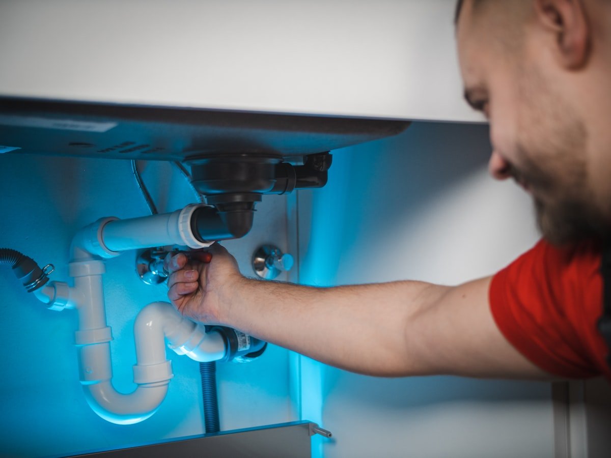
Homeowners recognise stock imagery instantly, even when they could not say why the page felt generic. What they want is evidence you have done this before: a finished boiler install, tidy pipework, a bathroom you completed, your van outside a house that looks like theirs.
Take twelve photographs on your phone over a fortnight. Unedited is fine and often better. This is the cheapest improvement available in web design for plumbers and the one most often skipped, because it requires remembering to do it on site rather than paying somebody.
Before-and-after pairs work particularly well for planned work. A corroded old system next to the replacement makes the argument for quality better than a paragraph ever will.
5. Credentials, in specifics
Trades are a trust purchase made by somebody letting a stranger into their home, which shapes everything about web design for plumbers.
Display your registrations with the actual numbers rather than a logo. Gas Safe registration in the UK, state licensing in the US, insurance cover and any trade body membership. “Fully qualified and insured” is what everybody writes, including people who are neither.
Add two things most sites omit. Whether you are DBS checked or background checked, which matters to people with children at home. And a photograph of you, so the person opening the door recognises whoever turns up.
The map pack matters more than the website
Uncomfortable for a web design company to write, and true. Web design for plumbers has a ceiling, and this is it.
Someone searching for an emergency plumber sees three map results before any website. If you are not in those three, your design work is invisible to that person. For trades specifically, the profile usually deserves attention before the site does — our guide to Google My Business optimisation sets out the five signals that decide those slots.
Reviews are the lever here, and trades have an advantage. A grateful customer whose heating you restored in February will write you a detailed review if you ask on the day. Ask while the relief is fresh, and ask them to mention the job and the town.
So the honest sequence for most trades is profile first, then the emergency page, then everything else. A beautiful site with no map presence is a shop with no sign on the road.
The pages a trade website actually needs
Six or seven. Anything beyond that usually exists because somebody sold it to you, which is the most common failure in web design for plumbers.
| Page | Its job | Needed? |
|---|---|---|
| Home | Number, area, hours, in that order | Yes |
| Emergency callout | Catch the urgent search | Yes — highest value page |
| Two or three planned services | Win the bigger jobs | Yes |
| Recent work | Photographs that prove competence | Yes |
| Areas covered | Plain list, plus 3 real location pages | Yes |
| About and credentials | Registration numbers, your face | Yes |
| Fifty town pages | None. They are a liability. | No |
Notice the emergency page sits second. In web design for plumbers it is the page carrying the most commercial value per word, and it is also the page most sites do not have at all.
Keep it brutally short. Number, hours, coverage, one line about response time, one photograph. Resist adding anything else to it, however tempting, because every extra element pushes the number further down a small screen.
Tracking whether any of it works
Web design for plumbers has a measurement problem office businesses do not. Your conversions happen by phone, and phones are invisible to analytics by default.
Two fixes. Track taps on the phone link as an event, which any competent developer sets up in minutes. And ask every caller how they found you, then write it down. That second habit is unglamorous and it beats most analytics dashboards for a small trade business.
Do it for a month and patterns appear fast. Most trades discover that a much larger share comes from the map listing than they assumed, and that their website converts better than they feared but gets reached less than they hoped.
That finding usually redirects the next spend away from a redesign and toward reviews and photographs, which is cheaper and works faster.
What trade websites waste money on
| Spend | Why it fails | Instead |
|---|---|---|
| A blog nobody writes | Three posts from 2024 signal an abandoned business | Skip it, or publish job write-ups four times a year |
| Full-screen video header | Slows the page badly on mobile data, which is where your buyers are | One real photo and a tappable number |
| Fifty templated town pages | Targeted directly by recent algorithm updates | Three or four genuine location pages |
| A quote calculator | Plumbing prices depend on what is behind the wall | A price range and an honest explanation of what changes it |
| Live chat widget | Nobody in an emergency wants to type | A bigger phone number |
The blog is the one worth dwelling on. Trades are sold content packages constantly, and the maths rarely works. Your buyers are not researching plumbing as a topic. They have a problem now, or they are choosing somebody for a job they have already decided on. Neither reads articles.
Where content does pay is job write-ups. A short page about an actual job — what was wrong, what you did, roughly what it cost, in which town — hits real searches and proves competence at the same time. Four a year is enough.
Directories, lead sites and where the website fits
Most trades already pay a lead site something every month, so it is worth being clear about how that sits alongside your own site.
Lead platforms sell the same enquiry to several trades at once. You compete on speed of response and usually on price, and you own nothing at the end of it. They work as a tap you can turn on when the diary is thin, and they are a poor foundation to build a business on.
Your own site and profile do the opposite. Slower to build, and every review and photograph compounds instead of resetting each month. The sensible position for most trades is both — pay for leads while the organic side builds, then reduce the spend as the calls arrive directly.
One practical warning. Check that your business name, address and phone number match exactly across your site, your Google profile and every directory you appear in. Inconsistencies there quietly hold back local rankings, and trades tend to accumulate a lot of old listings over the years.
An afternoon spent correcting those listings is unglamorous work that regularly outperforms a redesign.
Speed is not a technicality here
For most businesses a slow site is a slow leak. In web design for plumbers it is the whole problem.
Your visitor is on mobile data, often indoors, frequently on a poor signal, and always in a hurry. A page taking four seconds loses a meaningful share of them before anything appears. They do not complain. They tap back and call the next result.
Ask any agency for a stated speed target rather than a promise that the site is responsive. If they cannot give you a number, they have not thought about the conditions your customers actually browse in, and our website design packages guide covers what else a proposal should itemise.
Does a plumber even need a website?
Yes, but mainly as the place people land after finding you in the map results. The profile gets you seen; the site convinces them to call. Without the site you lose the planned, higher-value work almost entirely.
Should I build a page for every town I cover?
No. Three or four genuine location pages with real local detail beat fifty templated ones, and mass-produced town pages were a direct target of recent algorithm updates. Name your full coverage area in plain text instead.
Do I need a blog?
Almost certainly not in the usual sense. Your customers have a problem now or a job already decided. Short write-ups of real jobs work far better than general articles about plumbing, and four a year is plenty.
Should I publish prices?
Publish a call-out charge and hourly rate if you have them, plus ranges for common jobs. Homeowners assume the worst when nothing is stated. Explain what changes the number and you will get better-qualified calls.
Is a contact form enough instead of a phone number?
Not for emergency work. Nobody with water on the floor fills in a form. Keep a form for planned enquiries by all means, but the number must be tappable and at the top of every page.
How much of my budget should go to the website?
For most trades, less than you would expect, and more into your Google profile and reviews. Get found first, then improve what people land on. A polished site nobody reaches is the most common expensive mistake in this sector.
Winning the planned work, not just the emergencies
Emergency jobs pay the week. Planned jobs pay the year, and they are where good web design for plumbers earns its fee.
A homeowner replacing a boiler or fitting a bathroom will gather three quotes. They will look at all three websites before deciding who to let through the door. At that point you are not competing on speed. You are competing on whether you look like the safer choice.
Four things decide it. Photographs of similar jobs you have completed. Reviews from people in nearby streets. A clear explanation of what the process involves and how long it takes. And some indication of price, even a range, because silence reads as expensive.
Most trades quote and then go quiet. A short page explaining what happens after they accept — when you order parts, how long the work takes, what happens if something unexpected turns up behind a wall — closes more of those quotes than a lower number would.
That page costs an hour to write and you already know everything in it.
What to do this week
| Action | Time | Why first |
|---|---|---|
| Make the phone number tappable and move it to the top | 30 min | Recovers calls you are already losing |
| Name your coverage area in plain text on the homepage | 15 min | Stops people leaving to check |
| Take twelve photos of finished work | 2 weeks, passively | Replaces stock imagery |
| Ask five recent customers for a review | 20 min | Feeds the map pack, which outranks your site |
| Build one emergency page | 1 hour | Highest value page you do not have |
None of that needs a new website. If the calls increase, you have learned that your site was never the constraint — and you found out for the cost of an afternoon rather than a rebuild.
The ten-minute test
Hand your phone to somebody who has never seen your site. Ask them to find your number and tell you whether you cover their street.
Time it. Under ten seconds and the fundamentals are right. Over thirty and you have found your problem, and it is not the design — it is where the information sits.
That test is the whole of web design for plumbers compressed into one exercise. Everything else on this page is detail around making those ten seconds work.
Licensing and registration requirements differ by country and, in the US, by state. Display only credentials you actually hold and check current requirements with the relevant body. General commercial guidance, not legal advice. Last reviewed August 2026.