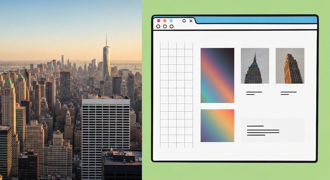
In a city defined by its bold silhouettes and daring facades, architecture inspired web design New York emerges as the hottest trend for brands seeking instant credibility and eye-stopping impact. Drawing on the vertical rhythm of Manhattan’s skyscrapers, the textured surfaces of Brooklyn brownstones, and the dramatic glass canopies of the Oculus, this design philosophy transforms websites into immersive digital structures. From seamless grid layouts to material-inspired animations and dynamic lighting effects, here’s how New York’s built environment is reshaping the web—and how you can harness these principles to build a site that not only looks stunning but ranks on Google’s first page.
1. Vertical Rhythm: Scrolling Designed Like Skyscrapers
Just as Midtown’s towers soar with deliberate setbacks and consistent column spacing, your homepage should guide visitors upward through content tiers. Implement a strict grid system with:
- Consistent row heights mimicking floor divisions
- Scaling typography that grows bolder at each “level”
- Fixed navigation that “sticks” like a building core
This approach reinforces responsive web design, ensuring that your site looks as cohesive on mobile as it does on a 27-inch desktop—much like how a skyscraper reads from street level or the observation deck.
2. Negative Space: Emulating Rockefeller Plaza’s Plazas
The open courtyards of Rockefeller Center create breathing room amid urban density. Online, generous white space:
- Highlights your key calls to action (CTAs)
- Improves readability by grouping related content
- Elevates your brand as sophisticated and uncluttered
By adopting this “plaza effect”, you boost user engagement and dwell time—crucial for SEO metrics like time on page and bounce rate.
3. Material Textures: From Concrete to Polished Steel
Brooklyn’s brownstone stoops and the sleek curtain walls of the Financial District offer tactile inspiration:
- Use subtle micro-animations to simulate concrete grain on backgrounds
- Layer semi-transparent overlays that echo frosted glass facades
- Incorporate metallic gradients in buttons and icons to suggest polished steel
These textures create depth without heavy images, aiding site speed optimization and satisfying Core Web Vitals.
4. Dynamic Lighting: Channeling Sunset on the High Line
As golden hour light floods the city’s elevated park, replicate its warmth with gradient transitions and hover effects:
- Soft, animated gradients that shift across hero sections
- Button shadows that intensify on hover, mimicking sunlight angles
- Section backgrounds that transition from warm amber to cool dusk tones
Such visual hierarchy guides the eye naturally—just as sunlight leads you along a scenic walkway.
5. Iconic Landmarks as Design Case Studies
| Landmark | Web Principle | Implementation Example |
|---|---|---|
| Empire State Building | Vertical modular grid | Layered card layout with fixed sidebar navigation |
| Oculus at World Trade | Curved lines & canopy overlays | SVG wave dividers and edge-to-edge hero overlays |
| Flatiron Building | Triangular layouts | Asymmetrical content blocks forming dynamic content paths |
| Brooklyn Bridge | Suspension-inspired connectors | Animated line connectors linking sections on scroll |
| Guggenheim Museum | Circular motifs | Rotating image carousels and radial menu interactions |
6. Mobile-First Mindset: Echoing Adaptive Facades
Many New York buildings feature adaptive shading and dynamic glass that respond to light. Similarly, ensure:
- Touch-optimized buttons with ample padding
- Collapsible headers that shrink on scroll
- Lazy-loaded images for fast mobile display
Google’s mobile-first indexing means this seamless experience directly impacts your search rankings.
7. Structured Data: Blueprint for Search Engines
Architects rely on blueprints; search engines rely on structured data. Implement JSON-LD for:
- Organization schema: your logo, address, and social profiles
- BreadcrumbList: hierarchy mirroring floor plans
- Article schema: author, date, and featured image
These “digital blueprints” help Google render rich results, boosting click-through rates.
8. Typography: Monumental and Readable
New York’s signage—from Grand Central’s Art Deco letters to neon marquees—melds style and legibility. On your site:
- Choose a serif headline font with strong vertical stress
- Pair with a sans-serif body font for readability
- Maintain a clear size hierarchy (e.g., H1 at 48px, H2 at 32px)
Proper contrast and spacing honor accessibility standards, boosting both UX and SEO.
9. Interactive Elements: Engaging Like a Guided Tour
Interactive features transform passive scrolling into a curated journey:
- Scroll-triggered animations revealing content floors
- Parallax layers simulating depth between “streets” of content
- Tooltips styled like museum plaques offering context
These elements elevate user engagement, increasing time on site and signaling quality to search engines.
10. Cohesive Color Palettes: New York’s Neutrals and Accents
The city’s skyline blends granite gray, limestone white, and occasional pops of copper or cobalt. For your brand:
- Base neutrals: #2E2E2E (granite), #F5F5F5 (limestone)
- Accent hues: #D88F1A (copper), #004E7C (cobalt)
- Use accent sparingly on CTAs and hover states
A consistent palette reinforces brand identity and readability across mediums.
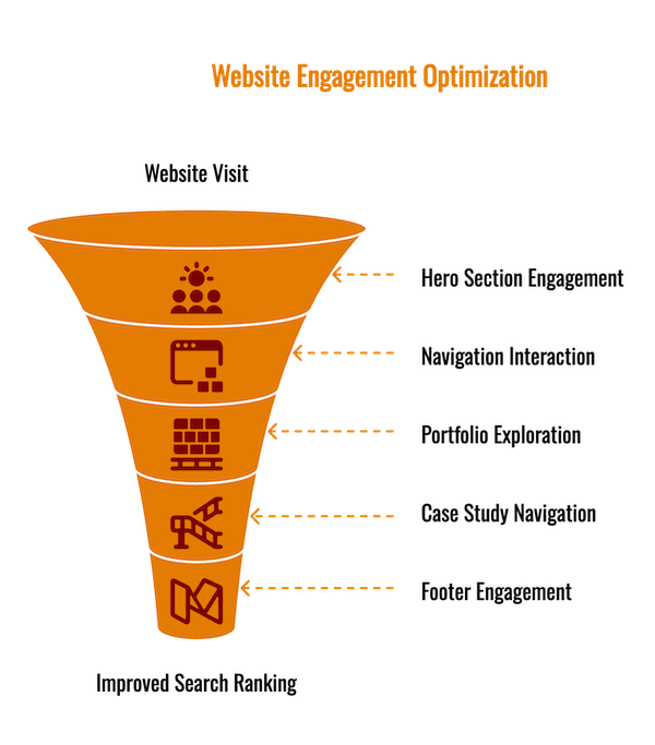
Bringing It All Together: A Design Walkthrough
Imagine a boutique architecture firm’s website:
- Hero Section: Full-screen gradient background shifting from dawn to dusk—mirroring sunrise over the Manhattan skyline.
- Navigation: Sticky sidebar styled like a building core, with floor-level indicators for “About,” “Portfolio,” and “Contact.”
- Portfolio Grid: A modular layout with alternating masonry blocks, each hover-revealing metallic sheen.
- Case Studies: Scroll-triggered line connectors guide users from one project to the next, echoing the Brooklyn Bridge’s cables.
- Footer: Radial menu inspired by the Guggenheim’s rotunda, offering quick access to social links and newsletter signup.
This cohesive, architecture-informed approach not only captivates visitors but also optimizes core metrics: fast LCP, minimal CLS, and extended dwell time—pushing you ahead in search rankings.
Trend Forecast: What’s Next in Architecture-Driven Web Design?
- AI-Generated Facades: AI tools that craft custom textures based on architectural photography.
- Virtual Reality Previews: Allow clients to “walk through” their new site in a VR model.
- Sustainable Design Analogies: Digital green building concepts—lightweight code, efficient hosting, and carbon-neutral servers.
By staying ahead of these innovations, your brand will continue to mirror New York’s spirit of relentless reinvention.
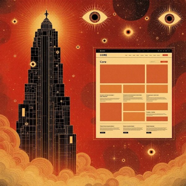
Conclusion
Architecture inspired web design New York harnesses the city’s iconic forms—from the vertical rhythms of Manhattan skyscrapers to the textured facades of Brooklyn brownstones—to craft websites that captivate users and excel in SEO. By incorporating grid-based layouts, generous negative space, material-inspired animations, and dynamic lighting effects, you can build a digital landmark that not only looks stunning but also ranks highly on Google. Ready to elevate your online presence without breaking the bank? Explore the 10 best free website builders for your business in our comprehensive guide on the best free website builders for your business, and get your free quote today to let us build your next masterpiece.